Visite au Musée d'Art Contemporain de Montréal
La première exposition que j'ai visité est celle d'Alexandre Castonguay intitulée « Elements ». Cette exposition m'a plu parcequ'elle créé un espace vivant et réactif aux actions de ses visiteur.
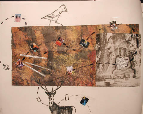
L'utilisation de l'espace total de la pièce se fait avant tout avec l'éclairage. La lumière de la pièce s'allume et s'éteint alternativement. Lorsque la lumière est eteinte, les projecteurs se réveillent tranquillement, projetant une lumière de plus en plus intense sur les murs de la pièce. La lumière des projecteurs forment des cercles aux contours flous qui s'étalent sur les murs. On remarque alors que c'est notre image qui est reflètée de manière différente par chaque projecteur. On devient à ce moment là acteur de l'oeuvre. On réalise toute sorte de omuvement devant les projecteurs pour voir comment ces derniers réagissent à nos mouvmeents. J'ai particulièrement aimé le fait que l'on ait à faire des efforts (chercher les caméras, se baisser devant les projecteurs) pour voir la totalité de l'oeuvre.
D'après le catalogue qui accompagne l'exposition, l'objet de l'oeuvre est de montrer que la réalité n'est pas tuojours ce que l'on croit. Ce thème n'e m'est pas tout de suite venu à l'esprit. Cependant, après réflexion, l'experience de se trouver dans une pièce vivante et d'avoir à faire des efforts pour comprendre comment cette espace réagit nous transporte vraiment dans une nouvelle réalité instable et changeante.
Les deux autres oeuvres qui m'ont marqué font parti de l'exposition « territoires urbains », qui regroupées les oeuvres de plusieurs artistes. Cette exposition a aussi pour thème notre perception de l'espace. Cependant c'est l'espace urbain qui est ici considéré. Les oeuvres s'inscrivent donc plus dans les problématiques contemporaines telles que l'urbanisation, l'environnement, l'individualisme moderne. La photographie Blindsight de Isabelle Hayeur montre en premier plan une nature au sol ravagé par des traces d'engins de construction et des arbres coupés ou cassés. En arrière se trouve des maisons en construction de type banlieux. Il s'agit donc de la construction d'un « nouveau développement ». Cette oeuvre nous montre que l'urbanisation se fait au total mépris de la nature pour recréer un environnement inventer par l'homme de tout pièce. L'environnement créé par l'homme, c'est à dire les maisons de banlieux qui sont toutes pareilles nous semble pourtant bien imparfait. C'est en quelque sorte une abscence complète de réflexion et de prise en compte de la nature dans l'aménagement de l'espace qui est ici critiquée.
Une vidéo faisant parti de la même exposition nous offre encore une autre vision de l'espace. Cette vidéo montre des images de lieux de spectacles, notamment des gradins, abandonnés. La réalisation de la vidéo est exemplaire et on est captivé par l'image, ces lieux qui devraient nous être familier nous sont présentés sous un jour nouveau, on le redécouvre et on aprend à les repenser.
posted by Thomas B at 1:51 PM
![]()